Trends in Web Design
Luke Wroblewski
The Write/Read mobile concept is the reason why many people purchase goods online from product reviews. They’re able to do this from their smartphones, applications such as Amazon & EBay take advantage of this technique incredibly well, however none of them work unless people add content to them.
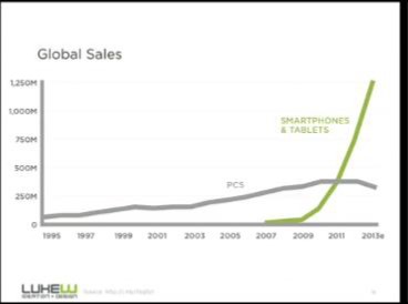
Products are purchased on the go, nobody wants to take the time and turn their laptop on etc. when we can purchase anything with just a swipe of our thumbs. From this you would think the responsive design method starting with the big screen first it kind of backwards for the way we access things today.
I prefer to design for mobile first as it’s the only form of media that is growing. If I design a mobile app which is suitable for cross device experience, I know from watching online conferences and following trends that it is going to get more online hits than it would if I was to make a webpage.
Mobile write/read has made our choices easier.
Vivamus fermentum semper porta. Nunc diam velit, adipiscing ut tristique vitae, sagittis vel odio. Maecenas convallis ullamcorper ultricies. Curabitur ornare, ligula semper consectetur sagittis, nisi diam iaculis velit, id fringilla sem nunc vel mi. Quisque mi metus, ornare sit amet fermentum et, tincidunt et orci.
Conquer the Blank Canvas
Meagan Fisher
Every designer knows what it’s like to stare at a blank canvas. The way that workflow has been set about is not very sufficient for the way websites are designed now; materials collected offline.
An important part in any development is understanding the client’s requirements. From this mission statements are created to ensure we stay on track and not interpret what we specifically like (even though this might be better).
When staring at a blank canvas, Colour and typography can become overwhelming as they portray a message which the client wants to share to the users. If done right it can be very powerful and makes the user experience a lot more enjoyable.
Due to the ever changing process in design, we now have to take into consideration mobile first and multi-platform responsiveness.
Many designers follow common workflow patterns although not every developer works in the same way, workflow is significant to the developer and use what they feel is the norm.
The mobile content mandate
Karen McGrane
With today’s technology it is hard to strategize the content for your website without knowing what would work for mobile only users and desktop users.
Personally I strategize my content in two forms, short form for mobile and long form for desktop users. This gives the overall user interactivity the ultimate experience as there is nothing worse than accessing a website from your mobile device and having to pinch/grab the screen in order to read the content.
A responsive design layout is always a safe bet, starting with mobile first as statistics show that 63% of people are mobile only users, so I plan for the wider target audience however cover both sides of users.
The main part of designing for mobile is mobile content strategy, plan the content with attractive headers and minimal text as mobile use can be hard for reading.
What the web needs next
Bruce Lawson
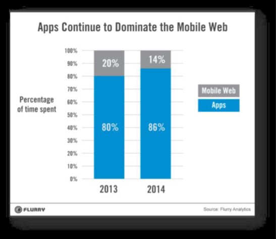
Recently mobile app usage has been up more than the web, why is this? Today it’s an app world and web lives inside of it.
The future of the web is swaying towards web apps and specifically native! Flurry’s statistics show a staggering decrease in web usage from current years and this is specifically because apps have the same content on them however they can be accessed offline.
With many people wanting to stay connected through web what isn’t to love about offline usage? It is a thing of the future.
Companies such as Opera are looking into including “Lazy Layout/Load” in apps as this will optimize loading time by displaying the important content first such as company logo.
A major factor of why the future of web is apps is from cross browser plat forming, each browser is significant and content isn’t always loadable throughout all of them. The web needs to keep open source to overcome what the future holds, I believe this could be done by browser vendors working together to achieve more cohort properties than what is seen today.
On web typography
Jason Santa Maria
Web typography unifies everything that we talk about on the web. If your type is bad then the whole design fails however good typography is invisible it’s as easy as that.
This is one of if not the most important element about web, it takes a lot of consideration when choosing a type such as how it will be used, what is its context, dimension and the list goes on. There are no rules in typography but there are guidelines!
In future projects I aim to find my own personal palette which represents my personality and portrays an image of myself to the reader. An element which I will have to consider is web constraints, what looks good as a display face and a text face in order to achieve quality.
Avoid using ready-mades – design is already baked in.

Future of HTML
Matt Asay
HTML’s future is growing in many areas people may not have expected it to. Native apps have been the thing of the future, seeing apples success being chased down by the android market. However now it’s become a multi-device world and developers can no longer afford to play favourites.
For me it has come as no surprise, web developers are trying their skills on a new platform and being able to target multiple devices, without choosing a new native language to learn. The mobile market is far greater than what it used to be so now this is the main focus for many web developers to be involved in.
Whereas this might not suite everyone, HTML5 will continue to expand within mobile app industry and will become competitive with the likes of Apple in the near future.
I’ve considered web applications in the past, knowing web skills means its far easier to interpret than learning new skill sets to become a native developer.
what I learned about web accessibility by pretending to be blind for a week 2014
David Ball
A large majority of web developers don’t consider accessibility when developing websites. visually impaired users prefer mobile websites as they are more accessible, so where is everyone going wrong, is it because were all so focused on being responsive and mobile first.
Obvious development elements include using alt tags on images, text to background ratio and don’t use tables. Every developer including myself follows these rules but a large majority of us have never tested our sites.
Popular screen readers like JAWS, show when used that the large multinational companies like Amazon are the worst for visually impaired users. Blind users can navigate through the use of HTML5 structural elements, which isn’t the way many of us including myself thought they navigated as it is presumed it is done by tabbing.
When developing a new site, be sure to try a screen reader and see how accessible your site really is.
Photoshop’s new groove
Dan Rose
A frequent question most web designers face; is Photoshop coming to an end through responsive web design. The answer to this is not necessarily it all depends on how the user develops.
Designing in the browser is more current than designing in Photoshop with many perks from doing this such as being free, interactive; access to web fonts and being responsive. Developers use piecemeal photoshopping as many of them feel more creative using Photoshop however not excessively.
To counteract with this dispute programs like Pagelayers are specifically designed to take html pages into Photoshop for when developers get stuck in code, specifically in the awkward sizing between desktop and tablet which I find myself noticing in responsive sites.
Paul Lloyd once tweeted – Design with the browser, but not in the browser, which most of us will agree on, Photoshop is an all-round more creative environment which will be around for many more years.
Technology - the power and the promise
Robin Christopherson
Technology has changed the way of people’s lives and how they live, specifically disabled users. Through inclusive ways of thinking, with technology comes opportunity which without technology many of them wouldn’t have.
Adaptability is key for disabled users, an example of this is Steven Hawkins, he controls his computer with a finger on his right hand which allows him to speak. Where would the world of science be without the technology that made this all capable for him?
Apples iPhone are leading over their highly competitive rivals Android for their accessibility to disabled users, with imbedded screen readers and functions such as FaceTime that allows the user to interact with others whether that be by sign language or other, it has opened up many opportunities. Specific apps have been designed around these users to enhance their lives, with many more promising technology to come such as autonomous vehicles.